Friday, 11 May 2018
Marketing Package
The movie Spaceballs utilizes synergy to create a brand image by using the same, characters, fonts and costumes across their marketing package, which consists of a trailer, movie poster and magazine cover. They use dark lighting which could imply that the film will feature dark themes, this is juxtaposed with the ridiculous characters and the motor home flying through space. This lets the audience know that though this is a parody and implies that any dark themes will be undercut by the silliness of the plot. This film is also an obvious parody of the star wars franchise and the certain aspects such as laser guns, space ships, the terrible chewbacca parody all helps to attract fans of the star wars franchise.


Wednesday, 9 May 2018
Filming/ Editing Reflection
When all is said and done, I'm quite pleased with our end product. Though there were some ups and downs in our productions and certain aspects would have been made a lot easier with some better planning, but in the end we persevered and created a product that we're all proud of.
Our first main obstacle was the selection of our shooting locations, because we were creating a period piece we had to be conscious that we couldn't show any modern technology, such as cars, smart phones and modern clothing ect. So we had to shoot in reletivly secluded locations, so we could could control what appeared on set. Some locations had a lot of footfall and others had parked cars, which would obviously be a detrimental to the setting we were trying to create.
Another issue, which persisted throughout the filmaking process was communication issues which lead to a litany of probelsm such as actors not showing up on time, missing props and actors ect. Some of the actors also had other commitments to their other lessons and in their personal lives, which led to us shooting scnenes later than we had ideally wanted and prolonged the filming process further.
Once we reached the editing stage, we had to re-learn how to edit as we had forgotten a lot of the skills we had learnt to edit out AS project.
Tuesday, 8 May 2018
Risk Assessment
Hazards
|
Who Exposed
|
Risk
| |
Slipping:
Prevention: To prevent slipping, we decided to film on days when the ground was relatively dry. |
Actors:
The actors that were exposed were (myself, Ramsay Laifa, Charles Payne and Mohammed Saad). Since we didn't get any consent from pedestrians or staff, we decided not to include them for our feature. |
Possible Injuries:
Fractures, head injuries, sprains, dislocations, e.t.c. | |
Filming near busy roads:
prevention: To prevent any collision with passing by vehicles, we decided to film in secluded locations |
Actors:
The actors that were exposed were (myself, Ramsay Laifa, Charles Payne and Mohammed Saad). Since we didn't get any consent from pedestrians or staff, we decided not to include them for our feature. |
None present
| |
Pots/Holes/Cobbles:
Prevention: Whilst holes were a risk as they were a tripping hazard, we couldn't really do much to prevent this other than to walk carefully and for pot holes. |
Actors:
The actors that were exposed were (myself, Ramsay Laifa, Charles Payne and Mohammed Saad). Since we didn't get any consent from pedestrians or staff, we decided not to include them for our feature. |
Possible injuries:
Fractures broken bones Bruises Seperations dislocations e.t.c. | |
Equipment being taken or stolen
Prevention: To prevent the equipment from being stolen, we assigned one of the group members to place the camera in their bag when taking it to our film locations, and only taking it out when filming or returning the equipment. |
Actors:
The actors that were exposed were (myself, Ramsay Laifa, Charles Payne and Mohammed Saad). Since we didn't get any consent from pedestrians or staff, we decided not to include them for our feature. |
Possible injuries:
No equipment to film with (no project) Having to pay a fine | |
Falling or barging over/into pedestrians
Prevention; We made sure that we would encounter minimal pedestrians by only shooting in secluded locations. Whenever a bystander would walk through our set we would put the camera away to assure their privacy be protected. |
Actors:
The actors that were exposed were (myself, Ramsay Laifa, Charles Payne and Mohammed Saad). Since we didn't get any consent from pedestrians or staff, we decided not to include them for our feature. |
Legal repercussions
bruises e.t.c. | |
Rain damaging the equipment
Prevention: As previously mentioned, we had selected a group member to keep the camera/equipment in their bag when going to/leaving locations. However if it were to start raining, than that selected group member would again place it in their bag. This would protect the camera or any other piece of equipment from rain/water damage. |
Actors:
The actors that were exposed were (myself, Ramsay Laifa, Charles Payne and Mohammed Saad). Since we didn't get any consent from pedestrians or staff, we decided not to include them for our feature. |
No equipment to film with (no project) possible electrocution
|
Mood Board
As we are creating a parody of the mystery/noir genre, we took inspiration from the aesthetic of both parody films and noir films. The noir genre typically utilized a dark and brooding aesthetic which melded well with the dark subject matter these films often dealt with. The protagonists in these kinds of films tended to be stern, intelligent and skilled in their detective field. A good example of the kind of character we looked at for inspiration was Humphrey Bogart, who wore a now conventional outfit consisting of a trench coat and a trilby, he was also often seen smoking a cigarette. In his films he was also a talented, suave detective who would always complete his case.
Though we took inspiration from those classic films, we find that parody is at it's best when it subverts stereotypes and reveals the absurdity of it's subject. So in contrast to the serious noir aesthetic, we also took inspiration from parody movies and defied audience expectations by making our detective a bumbling, untalented idiot. This like all parodies do creates an interesting and humorous dynamic between the absurdity of the characters and the seriousness of the plot.
Though we took inspiration from those classic films, we find that parody is at it's best when it subverts stereotypes and reveals the absurdity of it's subject. So in contrast to the serious noir aesthetic, we also took inspiration from parody movies and defied audience expectations by making our detective a bumbling, untalented idiot. This like all parodies do creates an interesting and humorous dynamic between the absurdity of the characters and the seriousness of the plot.
Talent Scouting
Due to our low budget, we had to make use of the resources we had at hand, so we decided to enlist our friends in helping us film and to play roles as actors. Charles played the bumbling detective, which in a way subverted audience expectations because he doesn't have the look of a typical detective. Similarly, the mob boss also subverted expectations because he neither looked nor acted ike a typical mob character.
BBFC
Universal (U) Ratings: This is suitable for people of all ages and contains very little to no objectionable material for people aged 4 and over. For example; Finding Nemo.

Parental Guidance (PG) Ratings: This is suitable for people of all ages- though some scenes may disturb children aged 8 or under. Infrequent moderate mild language and violence is allowed as long as it is justified by the films context. For Example: The Incredibles

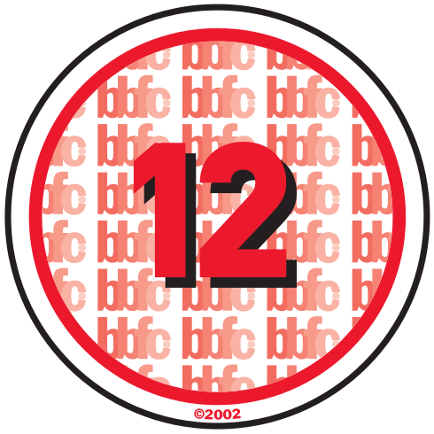
12A (Twelve and under with adult accompaniment): This only applies to cinema releases. People 12 and over may purchase tickets alone, but people under will need adult accompaniment. Often not suitable for those under 12. This rating allows adult themes such as discrimination and drugs, moderate language, violence, sex references and brief nudity. Though it can't be frequent and it must be justified by the context. For example: The Avengers.

12 Rating: 12A films are often given a 12 rating when they are released on home media, unless additional harsher content has been added. The content guidance are the same to the 12A ratings.

15 Rating: Suitable for people 15 and over. These films can contain adult themes, such as hard drugs, frequent strong language and violence and nudity without graphic detail (e.g. explicit shots of genitalia). Sex can also be shown without graphic detail. Sexual violence can also be shown if is contextualized. For Example: John Wick 2.

18 Rating: Suitable only for those over 18. There is no limit on foul language, hard drug use and explicit sex references. Un-simulated sexual activity may also be allowed if justified by the context. Strong bloody violence and gore is also allowed and sexual violence may be shown if it is not eroticized or overly excessive. For Example: The Godfather.

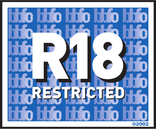
R18: Films with this rating can only be shown at licensed sex shops and cinemas and can only be shown to adults. Only films containing hard core pornography for the purpose of sexual pleasure. Strong fetish material and explicit animation is also in this category. This is the BBFC's most cut category- severe BDSM injury, spanking and urophilia and incest are just some of the often demanded cuts. For example: Poor Little White Boy- a classic of this category.


Parental Guidance (PG) Ratings: This is suitable for people of all ages- though some scenes may disturb children aged 8 or under. Infrequent moderate mild language and violence is allowed as long as it is justified by the films context. For Example: The Incredibles

12A (Twelve and under with adult accompaniment): This only applies to cinema releases. People 12 and over may purchase tickets alone, but people under will need adult accompaniment. Often not suitable for those under 12. This rating allows adult themes such as discrimination and drugs, moderate language, violence, sex references and brief nudity. Though it can't be frequent and it must be justified by the context. For example: The Avengers.

12 Rating: 12A films are often given a 12 rating when they are released on home media, unless additional harsher content has been added. The content guidance are the same to the 12A ratings.

15 Rating: Suitable for people 15 and over. These films can contain adult themes, such as hard drugs, frequent strong language and violence and nudity without graphic detail (e.g. explicit shots of genitalia). Sex can also be shown without graphic detail. Sexual violence can also be shown if is contextualized. For Example: John Wick 2.

18 Rating: Suitable only for those over 18. There is no limit on foul language, hard drug use and explicit sex references. Un-simulated sexual activity may also be allowed if justified by the context. Strong bloody violence and gore is also allowed and sexual violence may be shown if it is not eroticized or overly excessive. For Example: The Godfather.

R18: Films with this rating can only be shown at licensed sex shops and cinemas and can only be shown to adults. Only films containing hard core pornography for the purpose of sexual pleasure. Strong fetish material and explicit animation is also in this category. This is the BBFC's most cut category- severe BDSM injury, spanking and urophilia and incest are just some of the often demanded cuts. For example: Poor Little White Boy- a classic of this category.

Evaluation
Synergy has been created in my product through the use of various aspects. Firstly, i used the exact same fonts and colors in both my magazine cover and my film poster, as a way to convey the same messages etc across all three of my media. The titles/other texts were always written in red, which could signify that the main character is in some kind of danger. I also chose to use the Total Film magazine brand when designing my magazine cover because it is a well respected logo and is specific to movies. This means that people are more likely to view my product, as they will follow the word of a magazine that they trust. The different range of textual details that were carried over into all three of my products, included the color scheme, font type and costumes/facial expressions etc. As you can see from my trailer, magazine cover and poster, i have used the same costumes and props. I also portrayed the same stern facial expressions as a way to link my three media together and to show that the main character may have a dark side of sorts. I also conveyed this message through the use of lighting, e.g. having the character standing in the light. This could be a way of contrasting his outer darkness, with the fact that deep down inside, he is really the good guy.
From conducting a second survey/focus group, I was able to determine what my target audience thought of the finished product. After this audience watched the finished trailer, we asked them a series of questions about what they liked and what they didn't like. We were surprised to find out that the audience believed that us making the film a PG was a bad decision, as it did not fit the parody genre that well. We did however find out that the audience enjoyed the various costumes/props etc, as they were reminiscent of the classical detective genre and characters such as Sam Spade etc. After conducting the second focus group etc, we were pleased to know that the audience stood behind our final product and this gave us a sense of fulfillment and success. We wanted to make our product a parody, due to the fact we are massive parody film fans ourselves and also the fact that there has not been a descent parody film released on the market in a long time. We also wanted to choose this specific audience (PG) because it meant that anybody could see the film, e.g. families and also people who just want to watch an enjoyable movie every now and again.
We used a wide range of technology when constructing/creating our product to show that we are diverse in terms of our skills. For the filming of my trailer etc, I used a professional high quality style camera and also a low quality handheld camera. I only used this camera for the montage scenes etc, as it was easier to carry around/set up. With the editing of my trailer/magazine cover and poster, I used an editing software known as Premier Pro, to create the final products. This is due to the fact that it was user friendly and that I was able to create professional style movies for nothing. In terms of the presentation of all my research/coursework, i used website called Blogger, which is a unique way of presenting coursework etc in the form of a blog. I also used Survey Monkey to create/present my audience surveys and their feedback.


Editing
When editing our trailer, we used numerous tactics to get our message across to the audience and to make them want to see our film. Firstly, we used various camera angles etc to make certain characters appear more dominant than others, e.g. we used high angle shots when filming the mob boss and low angle shots when filming the private investigator, which helped to connote that the mob boss is superior to the P.I. and that he should not be taken lightly. We also left in a few mistakes and added in some horribly cut shots to our trailer, as a way to show the audience that we are breaking the typical conventions of the genre, as well as adding a comical affect in the process. Mise en scene also played a part in the project as it allowed us to again parody the classic detective genres, via the use of period correct clothing such as top hats and a Sam Spade style trench coat etc. We also played around with the lighting in our final product and managed to make our trailer black and , which is also very typical of the 40’s style Marilyn Monroe movies, as well as adding artificial lighting through the use of flashlights/lightbulbs etc. Finally, we were able to find some quite forestry areas to film in, which added an aesthetic and natural aspect to the trailer itself.
Friday, 4 May 2018
Tuesday, 1 May 2018
Provisional Sketches
These are our provisional sketches for the two main characters in the film. The first is the P.I. and as you can see he is wearing the typical clothes that you would find a 40's man dressed in. We wanted to use these types of costume as they fit in with our chosen genre. As well as this, he is wearing a fedora, which is also part of the classical detective attire.
The second sketch is the mob boss and as you can see he is also wearing a trench coat. He does however have a cane, which makes him appear to the audience more dominant and classy.
Subscribe to:
Comments (Atom)


